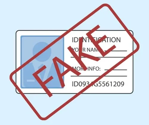
Crafting a professional-looking USA driver’s license template requires more than basic design skills—it demands attention to detail, adherence to official standards, and an understanding of state-specific nuances. Whether you’re creating a template for educational purposes, prop design, or personal knowledge, the goal is to replicate the look and feel of an authentic license. This guide breaks down actionable steps to elevate your template from generic to genuinely professional.
1. Start with Official Design Standards
Before sketching your template, research the physical and visual standards that real U.S. driver’s licenses follow. Every state (and the District of Columbia) issues licenses with unique features, but most adhere to guidelines set by the American Association of Motor Vehicle Administrators (AAMVA). Key details to note include:
- Size and shape: Most licenses measure 2.125 inches (height) by 3.375 inches (width), matching credit card dimensions. Some states, like California, use vertical layouts for under-21 drivers.
- Material simulation: Real licenses are printed on polycarbonate or high-grade paper with a laminated finish. For digital templates, mimic this by adding subtle texture overlays or a soft gloss effect.
- Mandatory elements: All licenses include a photo, full name, date of birth (DOB), license number, expiration date, address, and a state seal. High-security licenses (REAL ID) also feature a star symbol in the top corner.
For example, Texas licenses include a larger photo area, while New York uses a distinct blue-and-white color scheme. Study recent samples from your target state’s DMV website to capture these specifics.
2. Choose the Right Design Tools
Professional results depend on using tools that support high precision and resolution. Avoid basic tools like Microsoft Word—instead, opt for software that handles vector graphics and detailed editing:
Recommended Software:
- Adobe Illustrator: Ideal for vector-based elements (logos, seals, text). Its grid system ensures perfect alignment, and it supports Pantone color matching for accurate state-specific hues.
- Adobe Photoshop: Best for photo editing (retouching the license holder’s image) and adding texture or security features like holograms.
- Canva (for beginners): Offers pre-made templates with adjustable elements, though it lacks the precision of Illustrator for tiny details like microprinting.
Pro tip: Set your canvas to 300 DPI (dots per inch) to ensure sharpness when printed. Save files in PDF or PNG format to preserve quality.
3. Perfect Layout and Typography
A cluttered or misaligned template immediately looks unprofessional. Follow these layout rules:
Grid System:
Use a 12-column grid to align elements. For example:
- Photo: Typically occupies 3-4 columns on the right (1.25×1.5 inches).
- Personal info (name, DOB, address): Align left in 6-7 columns, with larger font sizes for primary details (name, DOB) and smaller sizes for secondary info (address, organ donor status).
- License details (number, expiration date): Place at the bottom, centered or aligned with the state seal.
Typography Rules:
Most states use clean, sans-serif fonts for readability. Common choices include:
- Arial (used in many states for main text).
- Helvetica (favored by states like Florida for its modern look).
- Custom state-specific fonts (e.g., California’s modified version of Myriad Pro).
Avoid mixing font styles—stick to 1-2 fonts max. For example, use bold for headings (e.g., “DRIVER LICENSE”) and regular weight for body text.
4. Replicate Color and Security Features
Authenticity hinges on nailing the color palette and security elements that deter forgery. Here’s how to simulate them:
Color Accuracy:
States use distinct color schemes. For instance:
- Florida: Blue gradient with gold accents.
- Michigan: Green and white with a gray stripe.
- Texas: Red, white, and blue with a lone star emblem.
Use Pantone Matching System (PMS) codes to match colors exactly. Tools like Pantone’s color finder help identify the right shades.
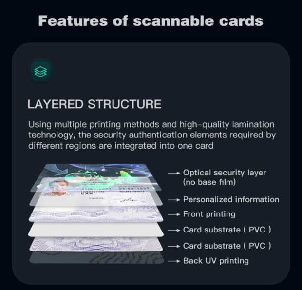
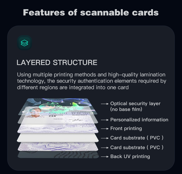
Security Features:
Real licenses include anti-tampering elements. Simulate these digitally:
- Holographic overlays: Use semi-transparent, gradient-filled shapes with a “prism” effect in Photoshop (Filter > Render > Lens Flare) to mimic light refraction.
- Microprinting: Type tiny text (2-3pt font) that reads “AUTH” or “STATE” when magnified. In Illustrator, use the “Type on a Path” tool for curved microtext around the seal.
- UV ink effects: Add a pale yellow or green layer (10-15% opacity) that “glows” under a blacklight. Label this layer as “UV Feature” for clarity.
5. Add Finishing Touches
Professional templates excel in the small details. Polish your design with these steps:
Texture and Edge Effects:
Add a subtle paper or plastic texture (use a 5-10% opacity overlay of a scanned license texture) to mimic real material. Round the corners to 0.125 inches (common for most licenses) using the “Rounded Rectangle Tool” in Illustrator.
Embossed Text:
Real licenses have raised text (e.g., the license number). In Photoshop, apply a “Bevel and Emboss” layer style (Depth: 50%, Size: 2px, Highlight Mode: Overlay) to make text look raised.
Quality Check:
Zoom to 200% in your design software to inspect for:
- Pixelated edges (resize images to original dimensions).
- Misaligned elements (use the “Align” tool to snap to guides).
- Font inconsistencies (ensure all text uses the same font and size).
Common Problems and Solutions
Problem 1: Template looks pixelated when printed.
Cause: Low resolution (below 300 DPI) or scaling images beyond their original size.
Solution: Set your canvas to 300 DPI. If using stock photos, crop instead of stretching. Save as a PDF (Print preset) to preserve resolution.
Problem 2: Fonts don’t match the state’s official license.
Cause: Guessing the font instead of verifying.
Solution: Download a high-res image of the state’s license from the DMV website. Use a font identifier tool (e.g., WhatTheFont) to match the typeface. For custom state fonts, purchase or find free alternatives (e.g., Myriad Pro for California).
Problem 3: Security features look fake.
Cause: Overly bright holograms or thick microtext.
Solution: Holograms should be semi-transparent (30-50% opacity). Microtext works best at 2-3pt size—test by zooming in to ensure readability under magnification. For UV effects, use soft yellows or greens (not neon).
Problem 4: State seal is incorrectly placed or sized.
Cause: Relying on outdated templates or low-quality seal images.
Solution: Download the official state seal from the state’s government website (e.g., California’s state seal). Resize it to 0.75-1 inch in diameter and place it in the bottom left or right corner (check recent license samples for placement).
Problem 5: Photo integration looks unnatural.
Cause: Poorly cropped photos or mismatched borders.
Solution: Use a headshot with a neutral background (white or light gray). Crop to 1.25×1.5 inches (standard size) and add a 1px black border. In Photoshop, use the “Liquify” tool to slightly blur the edges, mimicking the lamination process.
By following these steps, you’ll create a driver’s license template that stands out for its professionalism and attention to real-world details. Remember to use this knowledge ethically—templates are for educational or creative use only, not for forgery.